Building: The Naval Archive
Design notes on building a WW2 warship enthusiast site with Next.js and Tailwind CSS
Series: Code with Claude, Post #2
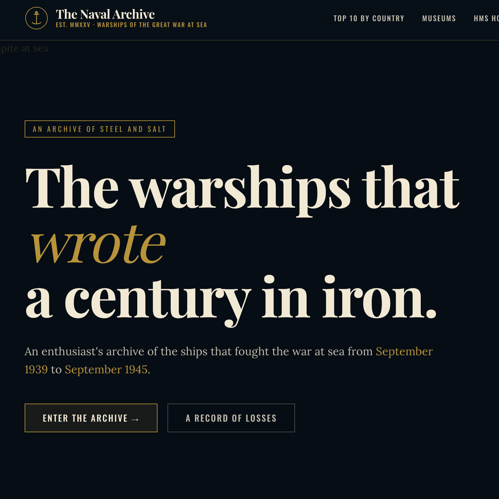
Building The Naval Archive: Design Notes on a WW2 Warship Enthusiast Site
April 2026 · Next.js, Tailwind CSS, Wikimedia Commons
There's a particular atmosphere to naval history — salt-worn, severe, and grand. When I look at a photograph of HMS Hood steaming through the Firth of Forth in 1940, or read the signals log from the Bismarck chase, I feel the weight of iron and the ruthlessness of the sea. Building a website for WW2 warship enthusiasts posed the same challenge any period archivist faces: how do you honour that atmosphere without tipping into pastiche?
This is my build log for The Naval Archive — an eight-section Next.js site covering Top 10 ships by nation, world museums, dedicated profiles for HMS Hood, Rodney, and Belfast, the career of Admiral Cunningham, and a multi-theatre battle timeline. Here's how it came together.
## The Aesthetic Direction
My first decision was conceptual rather than technical: what register does a naval history site live in?
I looked at plenty of existing sites in this space. Most lean military-utilitarian — grey backgrounds, tabular layouts, the visual language of a database dump. Others go the opposite way, reaching for drama with widescreen stock footage and motion graphics that feel more like a streaming platform than an archive. Neither felt right to me.
The direction I committed to was editorial archive: the sensibility of a serious illustrated reference — something like the Imperial War Museum's printed catalogues, or the dusty-but-authoritative volumes I'd find in a university naval library. In practice, that meant:
- Deep navy tones (
#0b1722) as the dominant canvas, not black and not grey - Parchment type (
#f2e9d5) rather than pure white — softer on dark backgrounds - Brass accents (
#b8933a) for decorative elements, links, and highlights — the colour of a compass or a telescope barrel - Rust (
#8b3a2a) as the danger/alert accent, echoing oxide and blood - A paper-grain texture layered over the whole page — a subtle SVG fractal noise overlay at 12% opacity in
mix-blend-mode: overlay
The grain is a small touch but it does significant work. On a digital screen it suggests physical media without screaming "retro"; it gives the dark background a slight dimensionality, and it helps the archival photographs feel at home rather than floating in a void.
## Typography
I settled on three typefaces, each with a distinct job.
Playfair Display carries all the display and heading work. It has the editorial authority of a broadsheet masthead, and its high-contrast strokes feel genuinely period-appropriate for a mid-20th-century archive. I set it at negative tracking (-0.02em) and a compressed line-height of 0.95 for the hero and section headings — tight enough to feel monumental without becoming unreadable.
Lora handles body copy. It's a scholarly book serif with optical kerning that reads well at small sizes. The slightly warm letterforms complement Playfair without competing with it.
Oswald plays the third role: stencil face. It appears in figure captions, stat ribbons, and navigational micro-labels — the visual equivalent of the stencilled markings on naval equipment. I set it in uppercase with generous letter-spacing, creating a typographic hierarchy that clearly signals "this is data or a label, not prose."
All three are loaded through next/font — no flash of unstyled text, zero layout shift.
## Structure and Navigation
I built the site across eight distinct sections using a flat Next.js App Router structure:
app/
  page.js              # home
  top-10/page.js       # 10 ships per nation, UK/USA/Japan/Germany
  museums/page.js      # 12 preserved vessels worldwide
  hms-hood/page.js     # ship profile
  hms-rodney/page.js   # ship profile
  hms-belfast/page.js  # ship profile
  cunningham/page.js   # career timeline
  timeline/page.js     # tabbed battle chronology
All editorial content — ship specs, museum descriptions, ranking data, battle events, and image URLs — lives in a single lib/data.js file. This was a deliberate choice on my part: it makes the site easy to edit without touching any component code, and keeps the page files clean, acting purely as presentational consumers of structured data.
I kept the navigation minimal: a horizontal bar with an anchor-chain logo mark, the site name in Playfair Display, and eight text links. On smaller screens it collapses gracefully — no hamburger menu tricks, just straightforward responsive stacking.
## Imagery: Wikimedia Commons and the Fallback Problem
Every photograph on the site loads from Wikimedia Commons — predominantly public-domain Royal Navy, U.S. Navy, and Imperial War Museum photographs. I whitelisted upload.wikimedia.org as a trusted image domain in next.config.js, and every Figure component links back to the source Commons page for attribution.
There was a problem I had to solve, though: Wikimedia Commons URLs occasionally go stale as files are renamed or reorganised, and next/image renders nothing at all on a broken URL — not even a visible error.
My solution was a SafeImage component wrapping next/image with an onError handler that swaps in a branded SVG placeholder. The placeholder renders a silhouette of a warship on the navy background with the brass-coloured site wordmark and the text "Image unavailable" — so a broken URL degrades gracefully to something that still looks intentional rather than leaving a blank void on the page.
Every ship card image — on the Top 10 rankings, the museum grid, the home section index — has a verified 1280px- Wikimedia URL mapped in lib/data.js. Anyone who needs to update one can replace it with a fresh Commons URL in a single place.
## The Photography Treatment
One of the smaller but more satisfying decisions I made: applying a CSS filter to every historical photograph through the Figure component:
**filter**: sepia(0.25) saturate(0.8) brightness(0.9);
It's subtle — not the full sepia treatment you'd apply to deliberately "age" a photograph, but enough to harmonise the varied source images into a cohesive visual language. A 1944 U.S. Navy official photograph and a 1990s museum shot of HMS Belfast tend to have quite different colour casts; this small filter brings them into the same family without destroying their documentary character.
## The Timeline Section
The most technically interesting page I built was the battle timeline — a tabbed chronology covering three theatres: the Battle of the Atlantic, the Battle of the Arctic, and the campaigns in the Pacific.
I managed the tab state client-side with a simple useState hook. Each theatre has an associated loss statistics strip — total ships lost, tonnage, lives — pulled from lib/data.js and displayed in the Oswald stencil face with brass rule separators. Below the stats, events render chronologically as a vertical timeline with alternating card positions: date and classification on one side, narrative and imagery on the other.
The human cost data was the most careful part to research and represent. Numbers like 3,500 merchant ships lost in the Atlantic and 36,000 merchant sailors killed deserve to be shown with weight, not buried in a table. I placed the stats strip above the narrative timeline as a permanent header for each theatre, so the reader is always aware of the scale as they scroll through individual events.
## Lessons
A few things I'd take away from this build for anyone tackling something similar:
One content file is enough to start. Keeping all data in lib/data.js felt like a constraint early on but turned out to be a significant advantage during iteration. When image URLs needed correcting or ship data needed refining, I always knew exactly where to look.
Dark-mode-first is its own design problem. Designing on a dark canvas meant rethinking contrast ratios, image presentation, and typography weight from scratch. My temptation was to over-brighten text and accents to compensate; the result looked like a gaming dashboard. Restraint and warm tones (#f2e9d5 rather than #ffffff) turned out to be the answer.
Texture does the work that illustration can't. The paper grain is two lines of CSS and an inline SVG. It contributes more to the archival atmosphere than anything more elaborate would have.
Historical subject matter demands accuracy. Ship specifications, dates, and career timelines are the kind of thing that naval enthusiasts know cold. I source-checked every fact; a wrong displacement figure or a misattributed quote would undermine the authority the design works so hard to establish.
The Naval Archive is a Next.js 14 site using the App Router, React 18, Tailwind CSS 3, and next/font. Images are served from Wikimedia Commons under various public-domain and open licences.


Comments
Loading...